How to Make the Best Newsletter Signup Form and Get More Subscribers
Updated: November 13, 2020
Newsletter signup forms are an important aspect of blogging as they convince people to subscribe to receive your emails. Learn how to craft the perfect newsletter signup forms your readers can't ignore.
Building a solid base of subscribers is the key to growing your blog as a business and your revenue.
But how do you convince your readers to sign up for the newsletter?
In this post, I'll walk you through the best practices to encourage newsletter signup. Follow these tips and you can start growing your subscribers count right away.
Offer value and educate people
The most used strategy to increase user signups to your blog is giving away discounts upon registration. Everybody does this.
Still, offering a discount with your email newsletter is not always as successful as expected.
It's not that discounts don't work. In fact, they do pretty well, that's why everybody is using them. But here's the problem. Because they are everywhere, they are becoming less effective. People can see through this kind of strategy. They realize that all you want is to make them purchase, so they are not so easy to manipulate into giving you their email addresses.
Almost any store offers a discount upon subscription nowadays, so the customers don't see as much value from them anymore.
And to grow your blog subscribers list, you need to offer value.
People want to have something to gain in exchange for their email address. Why would they want to flood their mailbox with emails otherwise?
And the value needs to keep on flowing. For a blog newsletter to be successful, you must offer quality content to your subscribers long term. Not only with one freebie, not only with your first email but with every email you send in their inboxes.
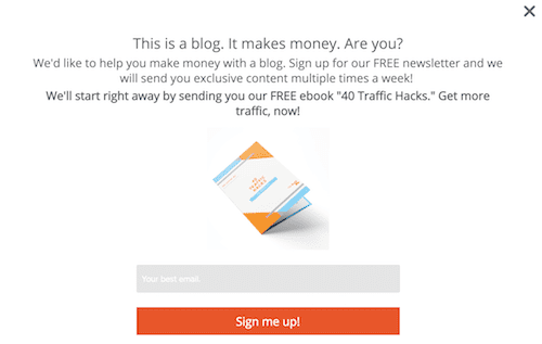
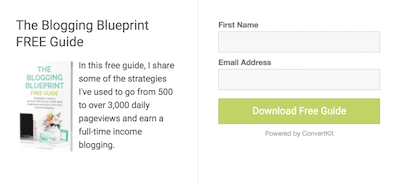
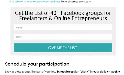
Like in this example. The newsletter signup pop up tells you what kinds of emails you'll be getting upon registration. You get tips on how to make money blogging multiple times a day, and you also get a free ebook. A valuable source of information for bloggers looking to make money.
The focus of a newsletter is not to sell, but to educate.
Yeah, you'll send out emails with promotions or new products, and you'll be pushing your readers further in the sales funnel through your emails. But the newsletter is more than that. Think of it as an exclusive mini blog. The last thing you want it to be is overly salesy. To keep your subscribers on the list and reading your emails, your newsletter copy must keep them entertained.
The newsletter signup copy
Go beyond the classic "Signup for our newsletter"
I come across these kinds of newsletter signup copy all the time. And they don't seem exciting at all. I mean, before I give you access to my inbox, first tell me why should I be subscribing to your blog newsletter.
What benefits do your subscribers get by signing up to your blog newsletter? Lay down the benefits and highlight them in the newsletter signup copy.
Also, you want to tell people how your blog newsletter is going to help them. People want to know what they get themselves into. And the better you manage to express that, the better the chances for people to give you their time (and email).
Forget about the “Join our newsletter” and think about something specific to your audience instead.
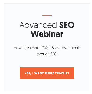
In this example, you can see how Neil Patel didn't use the classic “Join our newsletter”, and used “Yes, I want more traffic” instead. This is an example of a trigger expression which is far more exciting for readers to click on because it addresses a specific need and shows exactly the benefit at stake.
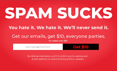
Here is another example of a pop up that goes beyond the classics.
Don't be afraid to come up with creative newsletter signup copies. People are tired of seeing the same thing over and over again. If you manage to be creative and different, and most importantly, address your audience's specific needs, you'll attract more subscribers to join your email list.
Let people know their emails are safe
Users are not so eager to give away their email addresses as they have concerns about how you'll be using the information. The main concerns are having the email sold to third parties, receiving spammy emails, or getting too many salesy emails.
One of the email signup form best practices is to let your readers know they have nothing to worry about upon registration. Let them know from the beginning how often you are going to send them emails, tell them you're not gonna give away their information and that they can opt out of receiving the blog newsletter anytime they like. Especially if you're a beginner blogger with a brand new blog, people will have a harder time trusting you with their personal data.
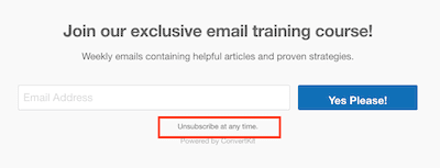
If you make people feel safe and in control of their data, there are greater chances they will hit the subscribe button.
Experiment with the call-to-action
Each time you subscribed to a blog newsletter, downloaded an ebook, or even an app, it was the result of a well-placed call-to-action.
Even if we're talking about advertising a product or simply about signing up for a blog newsletter, the call-to-action is still the one generating clicks.
There are many effective call-to-actions you can use in your newsletter signup copy. And how do you find what's the one converting best? By experimenting.
Here are some of the best call-to-action examples you can get inspired from.
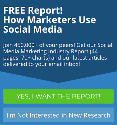
It's more tempting to click on something specific like this “Yes, I want the report!” Then a simple “Sign up”.
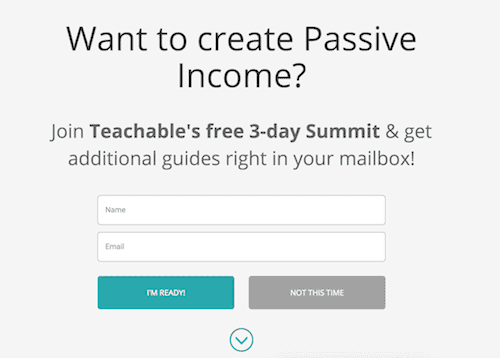
How about “I'm ready”? Does it spark some urgency?
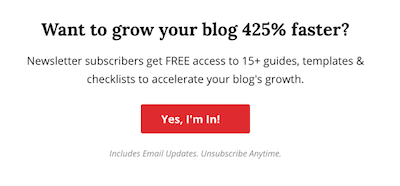
“Yes, I'm in!” Is also a great enthusiastic trigger.
Highlighting the specific benefit is also a great approach.
Email signup form best practices
There are a couple of things to keep in mind when creating your email signup form.
- Give them a reason to subscribe – As I covered earlier, you must give your readers a motive for them to give you their email.
- Don't ask for too many information – Having too many fields in your pop-in will reduce the conversion rate dramatically. Asking for the email is mandatory (duh!?) and asking for the name is a best practice because you'll then be able to send personalized emails (meaning your email won't start with a simple “Hello” but it'll directly address the receiver “Hello, Diana”.
- Make it as easy as possible to subscribe – Meaning you should never use a link for subscription (usually you can find those kinds of links in the blog's footer), you should have the box ready for people to fill in. People don't like to click through tons of pages.
- Play around with your newsletter name – It's not necessary to call your newsletter exactly that. You can think of something more exciting and fit to your blog.
The best place for the newsletter signup form
One crucial aspect of a newsletter that converts like crazy is where you put the newsletter signup form. Let's take a look over the main ways of advertising your blog newsletter.
Popup newsletter forms
Newsletter popups can be either really effective or extremely annoying. It's a thin line between the two.
The most important part with popups is timing. If you display a pop up the second the reader hits the page, you'll most likely lose that visitor.
Showing popups immediately when a visitor gets on the page is not effective. Especially when most of your blog traffic is from Google. If the visitor came from Google, there are great chances s/he doesn't know about your blog yet. And why would s/he subscribe to your newsletter immediately? In order for your newsletter signups to be successful, the reader must first get a chance to become familiar with your posts.
What makes a pop up successful:
- A background that differentiates the pop up from the page
- Engaging visuals
- Clear copy with enough whitespace so it doesn't overwhelm the readers
- An easy button to close the pop up (popups that are hard to navigate out of are making people angry)
Exit pupups
Exit popups are those which activate when the reader moves his mouse toward the exit button. And they are highly effective.
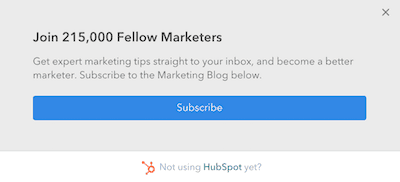
Here's an example of an exit popup on the Hubspot blog. As you can see, it's not just a simple “Join to our newsletter” thing. They focus on displaying social proof. And this kind of approach is effective because it gains your confidence that the newsletter is valuable. If over 200k people are on the list than the newsletter must be good. They also tell you what you'll get by joining the newsletter.
Footer newsletter forms
Footer newsletter signup forms are the most used types of subscribing forms.
They are great because you can have them on every page, after each blog post, and they don't interfere with the user experience.
What's important when using footer newsletter signup forms is to design them so they differentiate themselves from the rest of the content. Bright colors are great for this.
In-line newsletter forms
In-line newsletter signup forms are those placed inside the body of a blog post.
They are effective because they work both as a visual break and as a reminder for readers that they can get more benefits. Still, you must be careful with using signup forms within the blog post copy because they can be distracting and annoying when overused.
The key to using signup forms effectively:
- Make them stand out from the content while not being too distracting
- Crafting special newsletter signup forms for specific blog posts
Sidebar newsletter forms
Another popular type of newsletter signup forms are the ones used in sidebars. You can find them on almost any blog. They are great because they don't interfere with the user experience.
I suggest you take a look over Neil Patel's blog as he's a master of newsletters signups. If you pay a bit of attention, you'll see he actually uses a lot of email newsletters forms on his blog. In reality, so many forms on a blog don't work the same for any blog. You must be careful with the number of signup forms you use, as plenty of them will overwhelm your visitors.
Neil is using a static newsletter signup form that stays on the screen even when you scroll down the blog post.

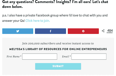
One opt-in form on the sidebar.
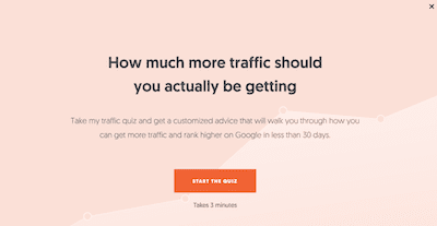
He also has a pop up that advertises a quiz, at the end of which, you might've guessed, asks for your email to give you the results.
An important aspect you should consider when placing your newsletters forms on your blog is how they will display on mobile devices.
Because mobile traffic keeps increasing, you want to focus on delivering a great user experience on mobile also.
For example, pop up newsletter forms on mobile are more annoying because they take up all the screen. Also, if you use newsletter forms in your sidebar, on mobile they will get pushed at the end of the blog post.
Newsletter signup design
The blog's visual assets have a great impact on the decisions your blog readers make. So let's take a look over the best tips for creating successfully converting newsletter signup forms.
Keep it minimal
Instead of overwhelming your readers with tons of copy and visual elements, go for a minimalistic design. Only keep the minimum of text required so your newsletter signup copy highlights the benefits.
Perfection is achieved, not when there is nothing more to add, but when there is nothing left to take away. -Antoine de Saint-Exupery
Use engaging visuals
An amazing idea is to use an animated GIF as the background of your pop up.
You can see this in action in some of Neil Patel's blog posts. He has exit popups set up, and when they display, you can see how the background is a GIF that shows how his posts rank number 1 on Google. These kinds of newsletter signups are one of the best converting signups he uses.
If your newsletter advertises an ebook, for example, you can show a GIF displaying the ebook. The idea is to show the reader what s/he will get by subscribing to your blog mailing list. The better you showcase the benefit of your newsletter, the more confident readers will be to give you their email addresses.
Steal from others
In blogging, you don't have to start from zero so you become successful. Actually, if you take things from the ground, trying to figure out everything yourself, you'll lose valuable time tackling unnecessary tasks and experimenting things others already did. Instead of trying to reinvent the wheel, take a look at what others are doing.
I'm not talking about copying exactly what others do. But don't stay away from analyzing others so you take away what works for them and use it to your advantage.
Check out other blogs, especially the big ones and analyze where they use newsletters signups and what types of forms they use. Especially with the big blogs, you can be sure they tested different approaches and use the ones that got the best results. What worked from them, might as well work for you too.
Give your subscribers options
This tip is especially useful for bloggers who run a multi-blog niche or even a personal blog.
If you, for example, cover more topics with your blog posts like lifestyle, blogging, and finance, it may be harder to attract and keep subscribers on your list. That's because someone might be interested in your blogging posts but not care about the lifestyle side. And guess what will happen after someone subscribed for blogging news and she receives an email talking about lifestyle? She will hit the unsubscribe button.
To avoid losing your subscribers, give them the option to choose what their interests are. Create separate email lists based on your blog topics and let your subscribers choose what newsletters to get.
Freebies are the key
Freebies refer to downloadable assets you give away for free, in return of an email address. You can also find freebies mentioned as lead magnets.
The best kinds of freebies you can give away with blog newsletter subscription
- Ebooks
- Templates
- Checklists
- Case studies
- Worksheets
- Quiz
- Audio recordings
- Ecourse
- Kits
- Resource Library
Freebies are not hard to create. You can even repurpose old blog posts by bundling them in a nice ebook.
Depending on your blog niche, you can also come up with out of the box ideas tailored to your audience. For example, if you have a fitness blog you can come up with a 30-days challenge for losing weight. If you're in the design, you can give away icons bundles, stock photos, and even fonts created by yourself.
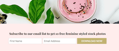
In the example above you can see how Elle Drouin gives her subscribers a bundle of stock photos. Specifically, feminine stock photos as her targeted audience are female entrepreneurs.
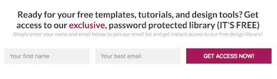
Another example is this newsletter signup form from Simplify Design. As you can see, they use a different strategy. Giving them your email address will get you inside an exclusive design library.
Create an email course
Email courses do a great job at encouraging people to subscribe to your newsletter. And they are quite easy to create.
I'm not saying that creating an email course doesn't take time. You do need to give it some of your attention so you come up with a great course. But it's worth each minute spend because of its high potential to convert readers to subscribers and, further on, to customers.
An email course is basically an autoresponder made out of a series of emails that go out over a period of time. Usually, they last for between 5 and 7 days and consists of a daily email. Each day, the subscribers receive a lesson that teaches them how to do a certain action.
Most of the times, bloggers use an email course as a way to promote their full paid course. By giving you these series of mini-lessons for free, they get to show the value their in-depth course can provide.
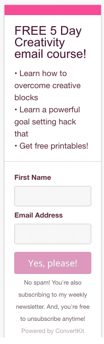
For example, Angela from Stray Curls created a 5 days email course on creativity.
Another example is the email course on the Simply Amanda blog.
Content upgrades give results
Having content upgrades for your blog posts is one of the best ways to grow your blog subscribers.
What's a content upgrade?
Content upgrades are an extension to your blog post. They give readers a bonus asset in return of their email.
Say you write a blog post about the best SEO practices for a blog. A content upgrade for such a post could be a checklist with all the tasks someone should tackle so they don't forget to optimize each aspect of their blog post. You basically add the same steps you introduced in your blog posts, but make it as a nice list someone can have at hand when creating a blog post so they make sure they took care of everything.
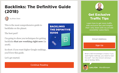
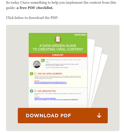
Check out how Brian Dean uses content upgrades in one of his blog posts. He wrote an in-depth blog post about the techniques of creating viral content. And he also summarized everything in a checklist that's easy for his readers to follow.
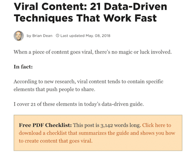
There are two places where you want to remember your readers about the content upgrade. Once in the first paragraphs of your blog post (like seen in the screenshot above) and once at the end of your post.
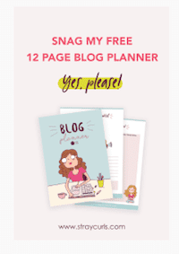
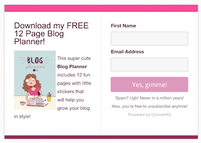
Here is another example of how Angela from Stray Curls offers a free blog planner in return of email addresses on her blog post about productivity.
She also advertises it in the sidebar as a sticky asset. Meaning the signup form stays on the screen even though you scroll through the content. This way, you can make sure your readers have access to it at any time.